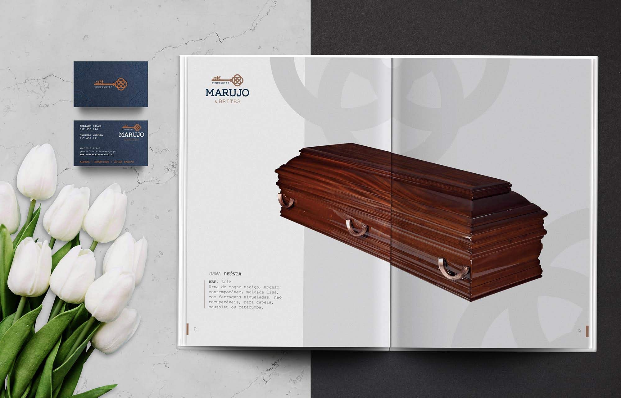
Funerária Marujo & Brites
Rebranding & Website
Working on the identity of the Funerária Marujo was one of the biggest challenges of the year, for several reasons:
- family business with over 100 years of existence;
- association of another brand to the group (Funerária Brites);
- combination of various elements imposed by the customer.
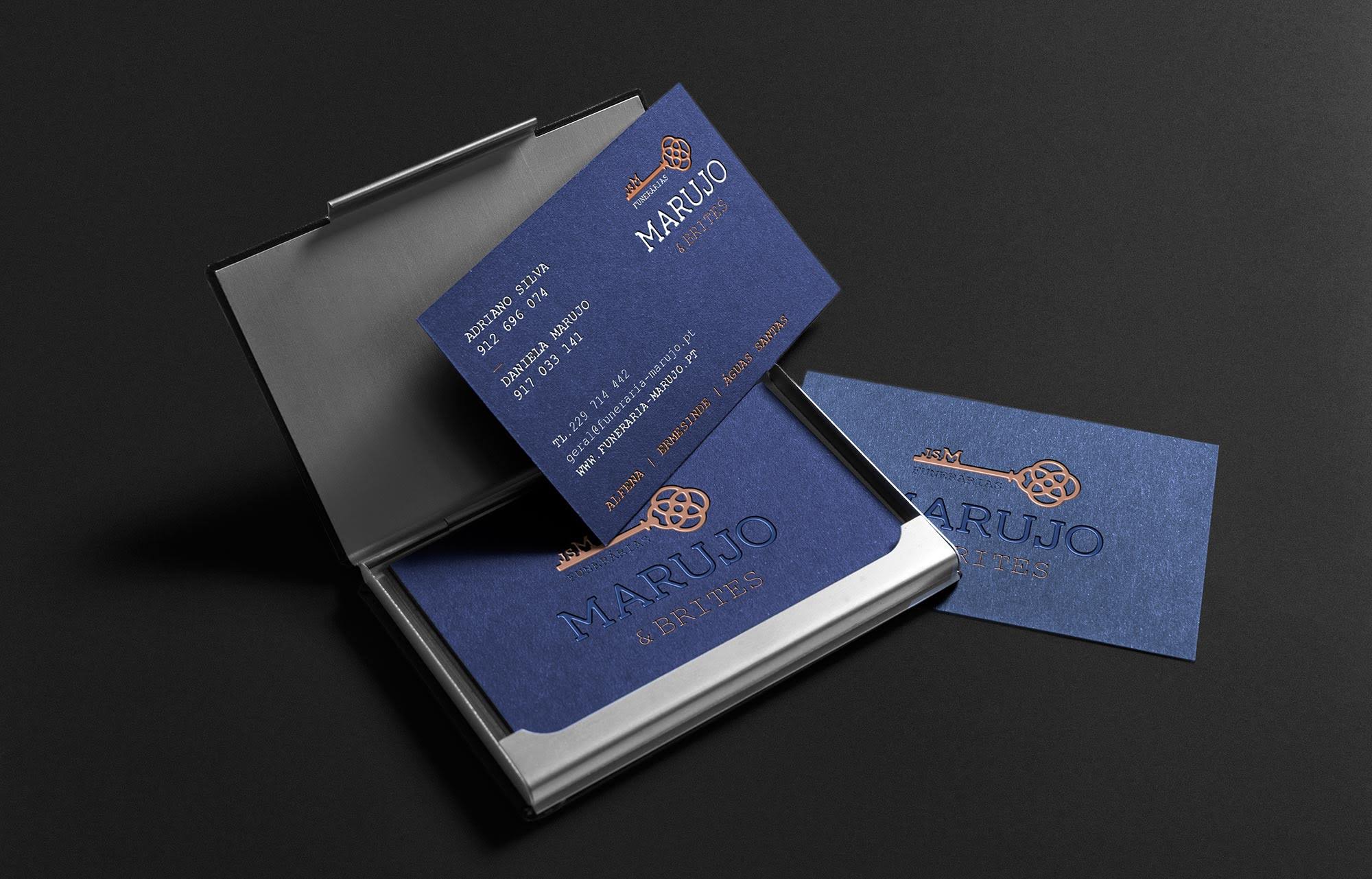
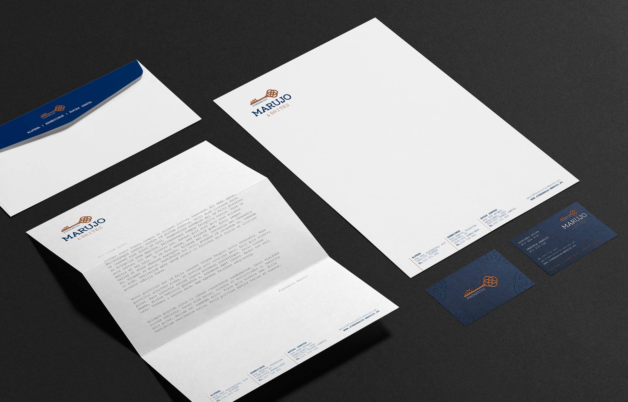
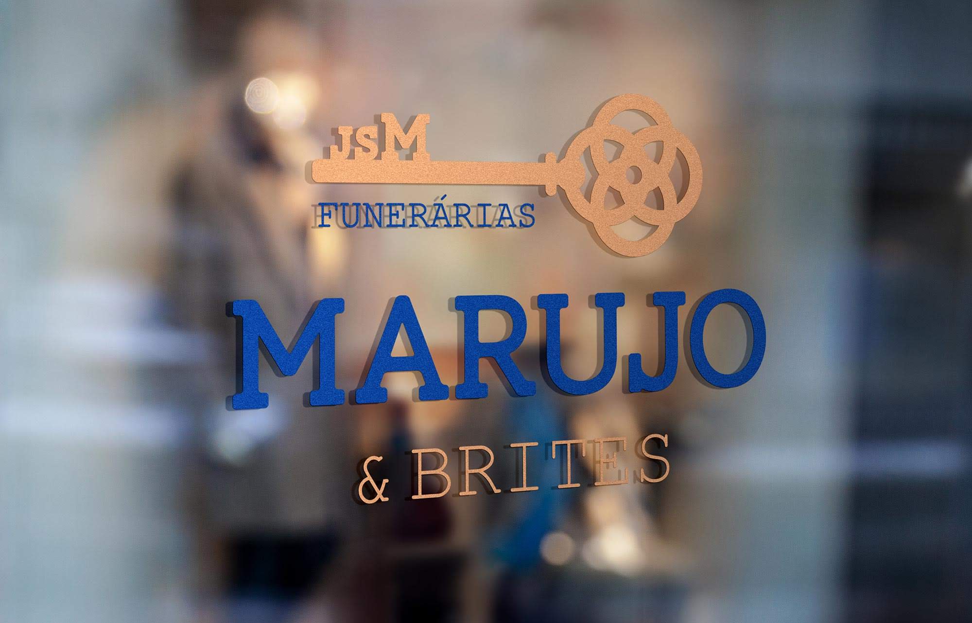
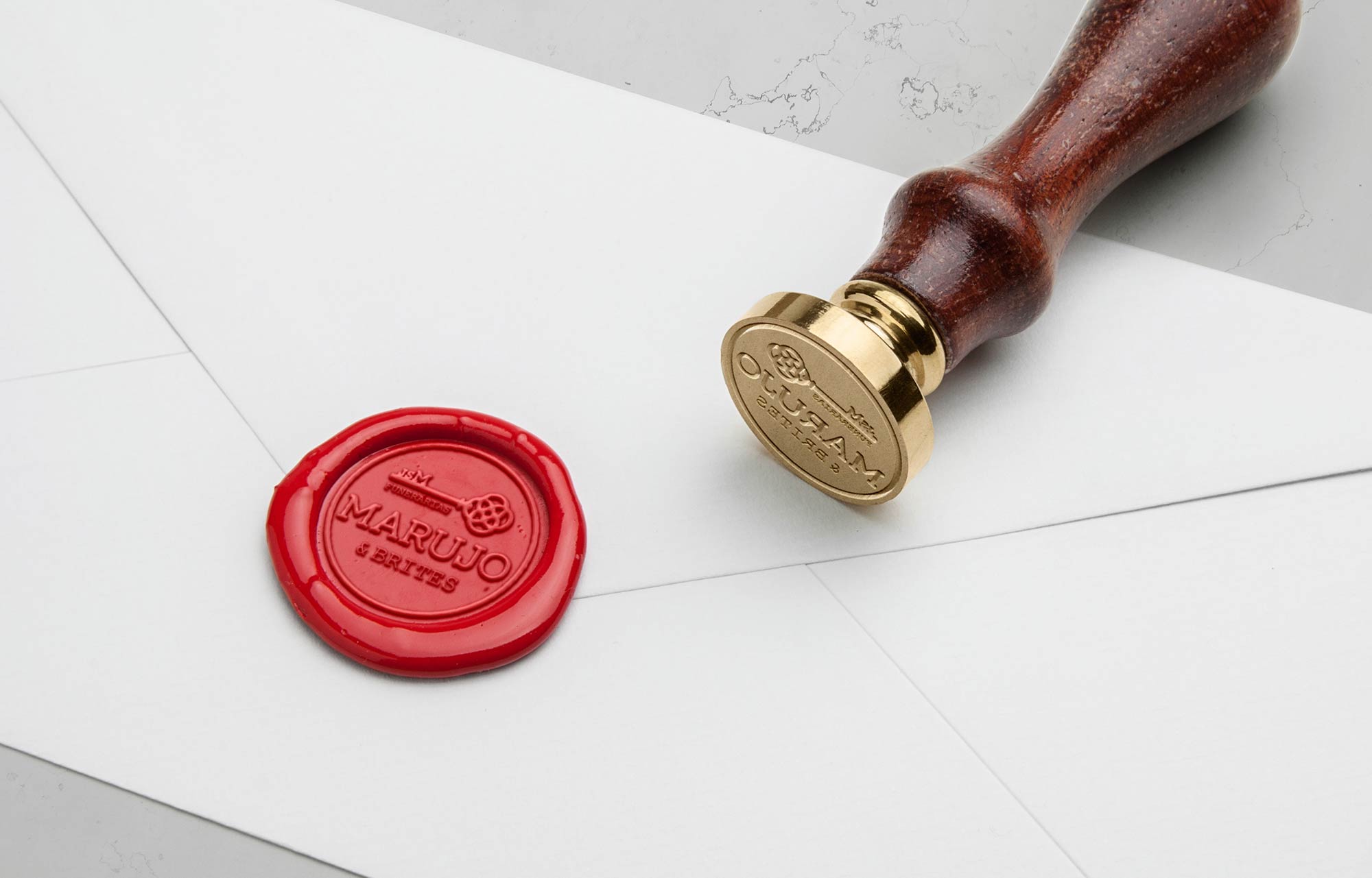
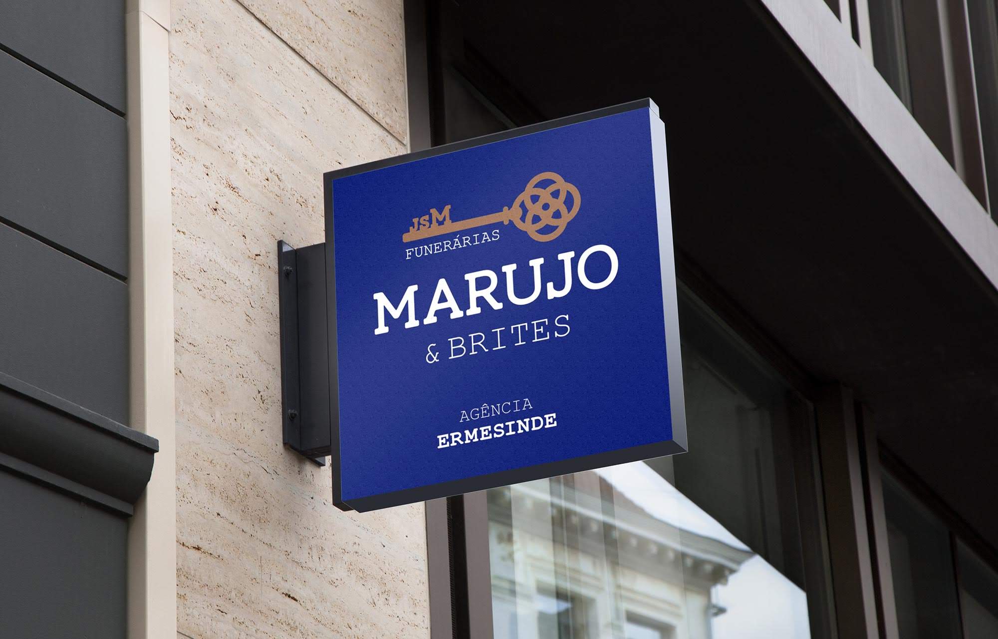
After a long process of collaboration between the Duas Faces team and the client, we have achieved a timeless symbol that does not refer to any religious, secular symbol, and at the same time, representative of the company's values: rings - represent the union between the four sisters who make up the society; their father's initials, José de Sousa Marujo - founder; and the key - symbol of the business area, the entry key in the "doors to heaven".
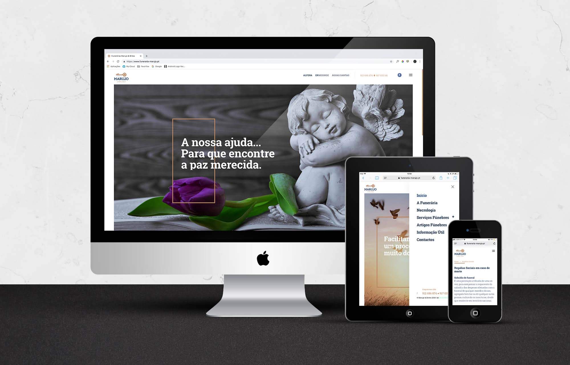
In addition to the entire corporate image, we were also in charge of building the website, responsive, completely manageable, window decoration, fleet, and many other elements associated with the business area.
Visit Website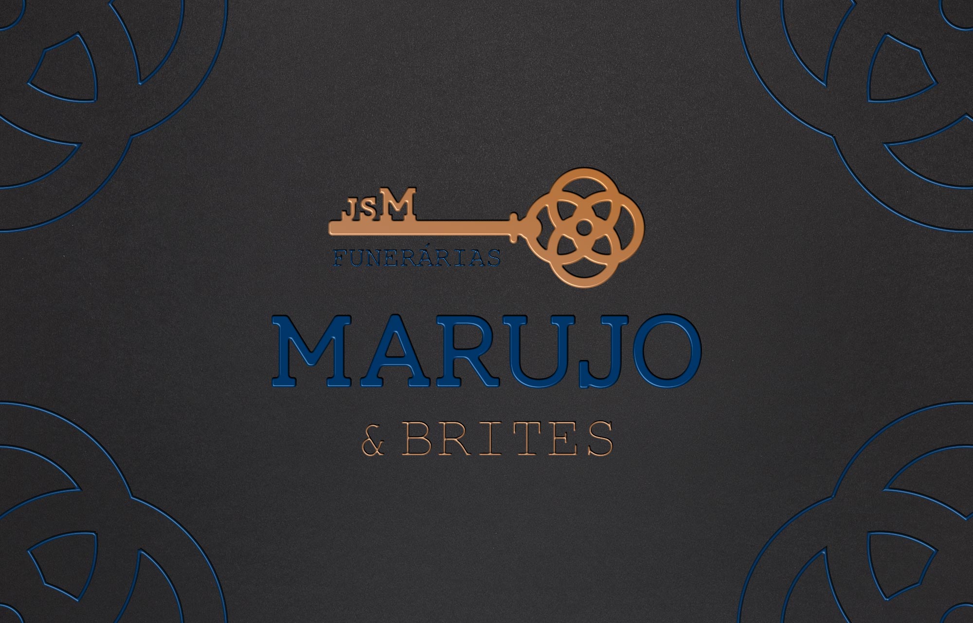

Copy
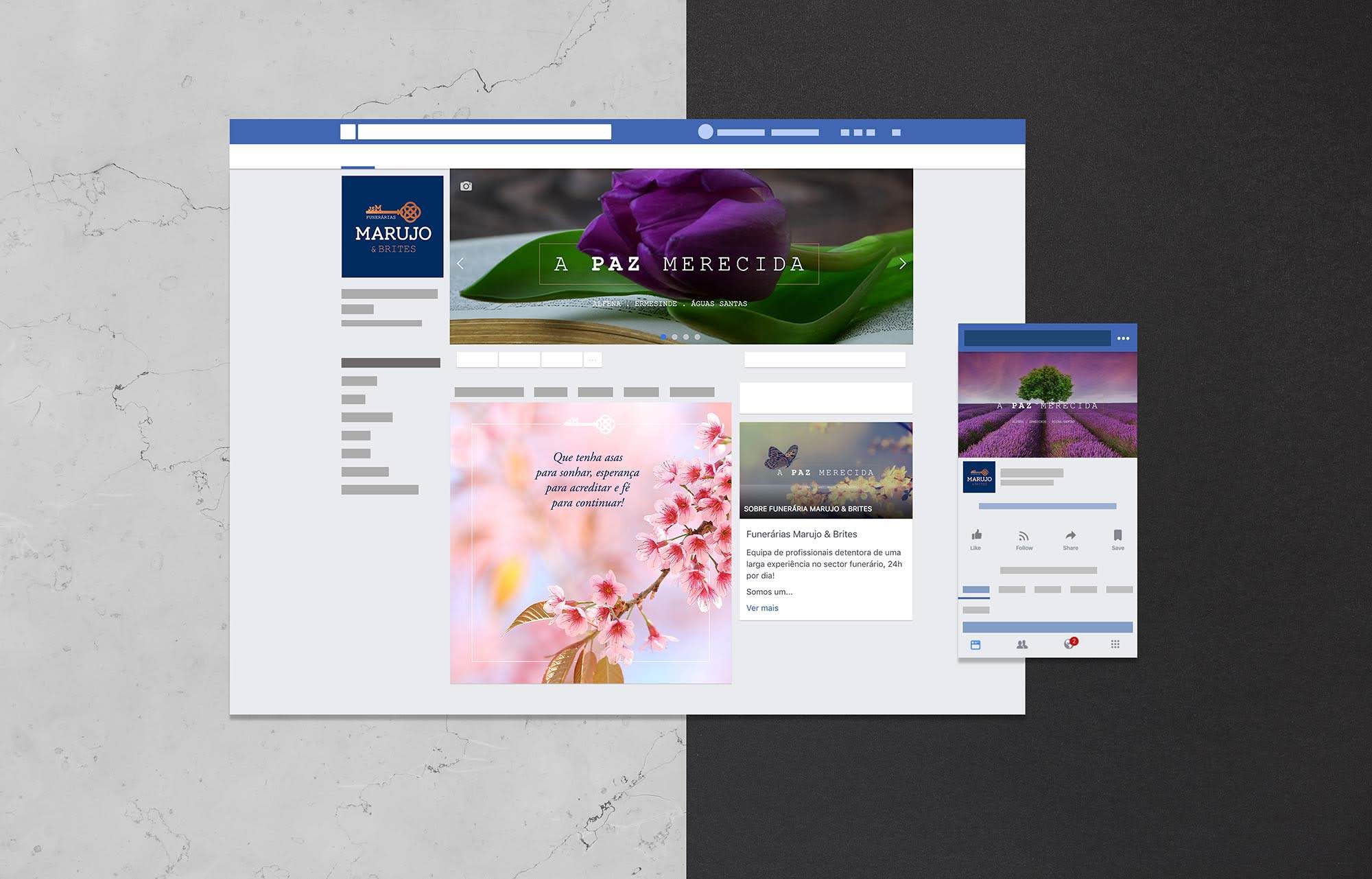
To complete and finish our work, we created a special brand signature for the funeral home:
"The deserved peace"


